
What is Responsive Web Design?
There’s still a lot of confusion out there about what responsive web design is and why it is so important. Here’s a quick video for you, to explain what it is and why it is so important for your business.
What is Responsive Design?
(Video transcript below)
Hey, it’s JR here and in this video we’re gonna look at what responsive web design is. So there’s a lot of confusion out there, still really new and there’s a lot of businesses that don’t understand it and there’s a lot of marketers that even really don’t fully grasp what responsive design is.
So, what we’re gonna do is just quickly run through an example of what it is and why it’s better than the traditional mobile websites that you probably used to seeing. So, as mobile phone started to do more and more things and grow and screens got better, you got full color screens, and their interactive and touch screen, you got a birth of mobile websites it was basically called.
Here’s are example of how a mobile website would have looked. Very simple, a few buttons, not a lot of options and again it’s built to fit a small screen size. However the problem became that this doesn’t work for every industry. It doesn’t have enough information or it may not be able to fit any of the different features that a website might need for some industries.
And so it was very limited to what these mobile sites would work for and these actually still work great for some companies, pizza would be a great example, that you know does still kinda work, you only need a few options you know menu, maybe a phone number, you know things like that. But for the majority of the businesses these mobile sites just didn’t work and here was the other problem, small phones, smart phones are all similar in size at this point, or where all similar in size this point. But now there’s so many different sizes, some of these phones are like a tablet themselves and then you had the tablet growth that was happening. And so websites weren’t differentiating between a smart phone and a tablet and you could imagine that these designs right here, on a tablet would have looked horrible. There’s way more room on a tablet that could have a whole website even, but it was limited to something like this and often times these would look stretched, because these are designed to fill the screen. So on a tablet or an iPad or something like that this would stretch out and just look horrible.
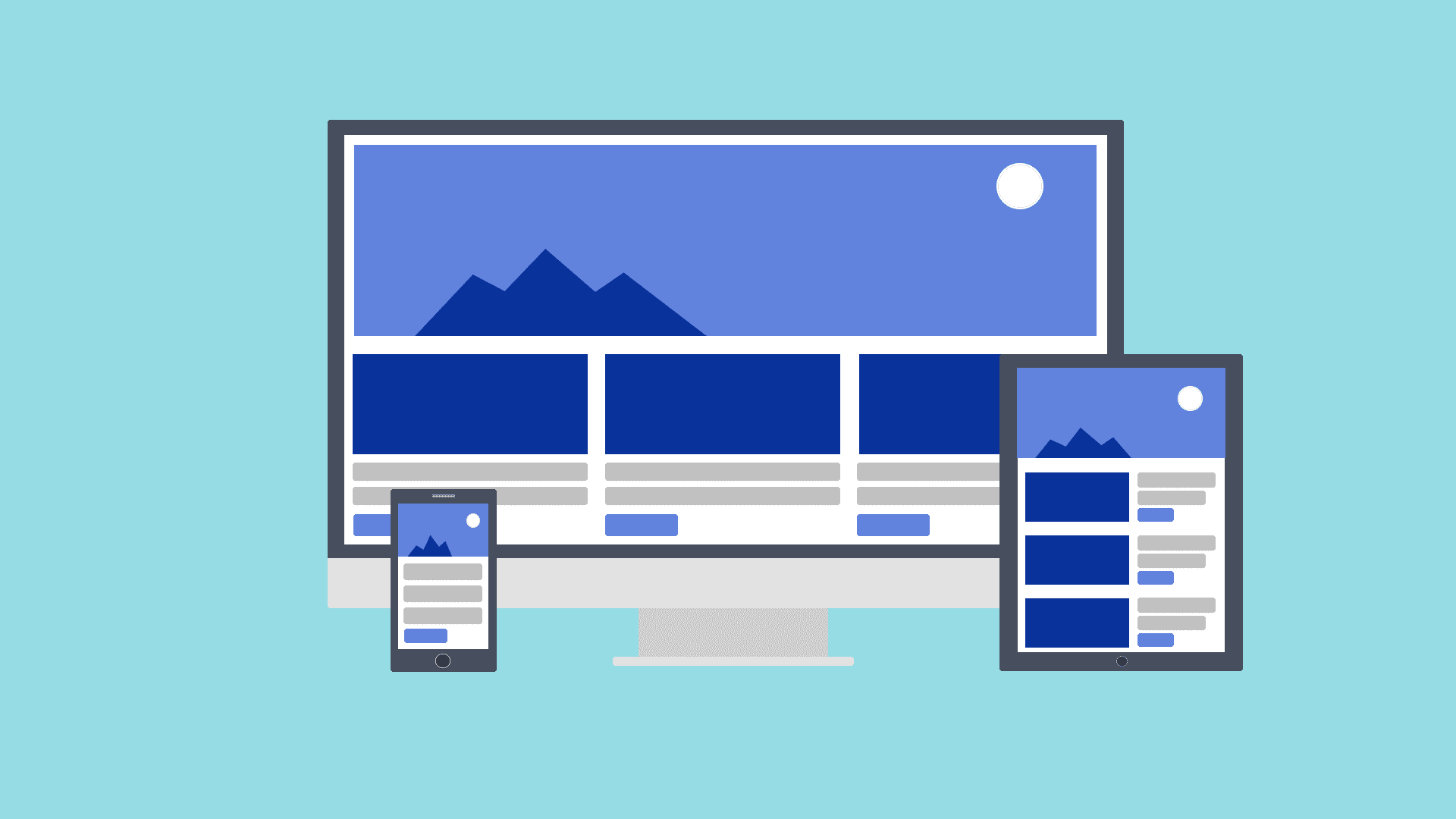
So, mobile design itself like this was a very short lived item. It just didn’t live up, to what was truly needed in every industry and for every website and for all the different devices. And what responsive web design is, is it means that it works on any screen.
So, you know, it will work on regular computer, laptop, tablet, smart phone and it doesn’t matter what size they are. The screen, the site would adjust for the actual device it’s on. So let’s look at an example of that. Here is the Sony website. Sony’s had a responsive web design up for quite sometime now. And you’ll see here is the full website. You’ve got menus here that are dropdown and by the way with touch screen it’s good to have this little “plus” icon that show that there is a dropdowns. By the way with touch screens it’s good to have these little plus icons that show there is a drop down there. But you can see, very simple header and there’s lots of graphics and things like that. And what’s gonna happen is that if I was to minimize my browser here and I where to start shrinking the size, what you’re going to notice is that the screen starts to adjust so you’re seeing the website (let me center this here), you’re seeing the website adjust as I move the browser-in and there it switches to now you’ll notice all the links that where in the navigation are now just a dropdown menu.
So it adjust as I move the site in, so as the browser changes size which would be what happens on for instance a tablet or a cell phone, the site will adjust and move itself, all the elements will adjust and move themselves and some menus will become dropdown, so in a different method of displaying.
This allows one website, not two websites, that was the other issue with mobile websites is that you got two website now that you have to maintain and keep up to date. In this case, this is one website, adjusting for the browser.
Here’s Mashable.com and you notice that Mashable actually has for instance, their menu is completely a slide out there and very touch screen friendly. By the way this does not work on most sites. This is great for Mashable but Mashable’s market will understand what this button does because it’s going to be a very tech, mobile friendly market. But if you had a business website, I would not recommend using this right away on all your sites. For instance some people may not know that. But these little three lines are becoming very recognized as, this means the menu. So that is something you can use but I don’t know if I would recommend using that right away. Mashable’s works, again their audience will know.
But let’s go ahead and shrink this down, what you’re gonna see is, you’ll the site start to adjust. You’ll see those boxes right there, see how they’re moving already and they’re shrinking down in size. They’re very adjustable. And the further we go in, it rearranges the lay out. You’ll see some of that layout instead of having four across, it’s now two across. And it adjusts and there it switches completely to a very mobile friendly. Everything is in one line, you got images and a teaser. So again, that is very responsive. One website for all devices.
Here’s one that we actually built for one of our clients. This is an order custom labels site, so you can imagine a little mobile site’s not gonna cut it for an e commerce site like this. This needs a lot of information, a lot of space for products. And so what you will notice is again is as I shrink in here, you’ll notice that the rotator is capable of shrinking. It hits different levels there it bounces in and now we’ve got our menu dropdown, this is more like in a tablet mode, the slider has adjusted and then you’ll notice as we go further in it’ll do it again and now this is more like a cell phone type of mode. We’ve got our menu has changed to a nice little dropdown and the slider has adjusted. These were four or five across, now they’re two across. And as you scroll down you’ll see the copy is all moved in and the sidebar have moved down. So it adjusts based on the size of the browser and there you can see it just changes as the browser changes.
So, that is responsive web design as fast as I can explain it. Works on any device that you would use. So again regardless of a big desktop monitor or you know thirteen inch or fifteen inch laptop to a 7 inch iPad mini or small tablet and then right down to a small smart phone. It doesn’t matter what device you’re on, the websites going to work on all of it. And this is important because right now mobile traffic on average is about 25% of visitors at this point. And that is growing enormously every single year. I think it was up 78% from last year, you know so last year probably somewhere around 10% or may be even less but we’re at 25% on average right now. And I just spoke with clients recently that are seeing 50% traffic and sometimes more are coming from mobile devices, so you need to be mobile ready and a mobile website is just not cutting it. Responsive design is the way you do that and hopefully this kind of explained for you what that means and how that works and do you can use that in your business. So again responsive just means it “responds” to the size of the screen. And it allows you to have one website for all devices. So hopeful that clears everything up on responsive design and you enjoyed the video and see will you in the next one.